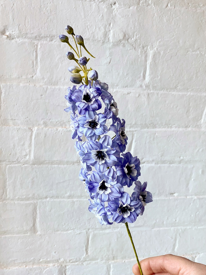
Very Peri by Pantone: a breath of creativity for your pastries
Pantone has just unveiled Very Peri, their brand new colour for 2022. Created to help us embrace our ever-changing world, Very Peri opens us up to a new vision as we rewrite our daily lives and adapt to new realities.
While last year saw the arrival of the elegant Ultimate Gray as well as the cheerful yellow of Illuminating, this year’s pick offers a warm hue that encourages innovation and creativity. These two adjectives describe more than just this colour; they also reflect the way the food industry has had to reinvent itself, adapt to a changing world, and remain creative over the last few months, things it will surely continue to accomplish in the months to come.
How to integrate Very Peri, Pantone’s colour of the year, into your sweet creations
Pantone’s Very Peri belongs to the blue family, featuring a touch of red-violet. This warm colour is a terrific choice for all kinds of baked goods and desserts. Mix our FONDUST® with fondant, cake mix, or our fat dispersible powder to colour your chocolate or buttercream decorations.
This versatile colour can be used for any event, from baby showers to weddings and sweet sixteens! No matter the occasion, you’ll be able to create a beautiful sweet table with cookies, cupcakes, candies, chocolates, and more.
We asked our ambassador Ben Fullard to incorporate this colour into one of his creative designs, and he decided to prepare a stunning edible flower creation.

Ben applied our Hybrid Petal Dust with a dry brush to colour his sugar flowers. In order to most closely approximate Very Peri, here are the products he used:
- Ultra White (T-002)
- Powder Pink (T-041)
- Hydrangea Blue (T-058)
- Wedgewood Blue (T-059)
- Autumn Blaze (T-044)
Pantone’s Very Peri and 2022’s wedding trends
One might imagine the strong impact Very Peri could have on various events, including weddings. According to Pantone, this new colour displays joyful energy along with a dynamic presence, and what could be more joyful than a wedding celebration? Beyond colouring a wedding cake or its decorative elements, you could also create a dessert table featuring small complimentary treats such as: Very Peri macarons with FONDUST® colouring, white cake pops with a silver sparkle thanks to our Hybrid Lustre Dust, chocolates with a complementary splash of colour, and so much more!
What colours complement Very Peri?
It can be a little tricky to match a colour when you’re not used to working with it. Luckily, the Pantone website offers interesting colour palette suggestions that could inspire you to create incredible designs. Here are some options that might spark your next big idea:
Here are some suggestions to help you approximate these colours using Roxy & Rich’s FONDUST®:
- Pantone Tawny Orange : Copper (F-033)
- Pantone Very Peri : Neon Blue (F-024) + Royal Purple (F-020)
- Pantone Iced Coffee : Tuscan Brown (F-034)
- Pantone Pink Flambé : Pink (F-017)
- Pantone Fuchsia Pink : Fuchsia (F-019)
- Pantone Paradise Pink : Neon Pink (F-018)
- Pantone Cornsilk : Ivory (F-003) + Egg Yellow (F-004)
- Pantone Tourmaline : Sky Blue (F-022) + a touch of Super Black (F-002)
Will Pantone’s new colour inspire you as you create your latest treats? Feel free to share your Very Peri creations with us on social media using #roxyandrich and @roxyandrich.

